Chapter 02 / Design elements

The parts a site is made of.

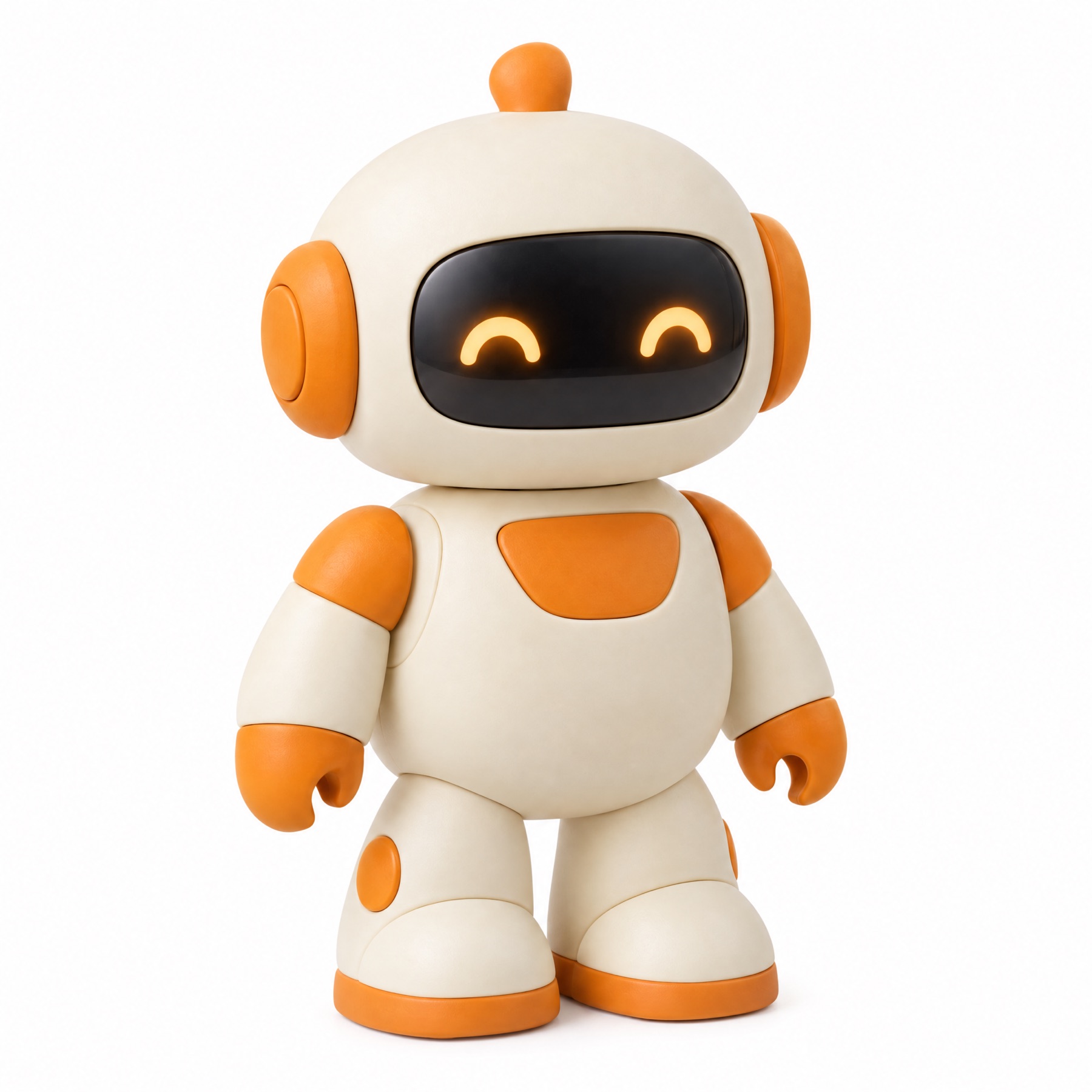
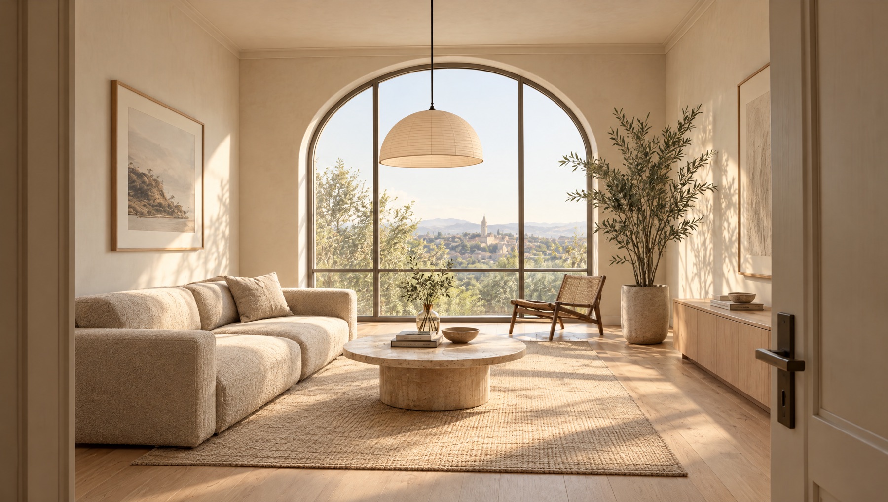
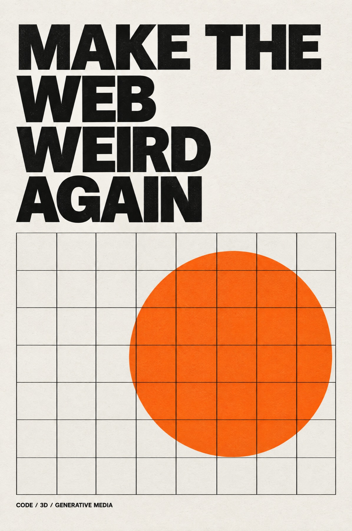
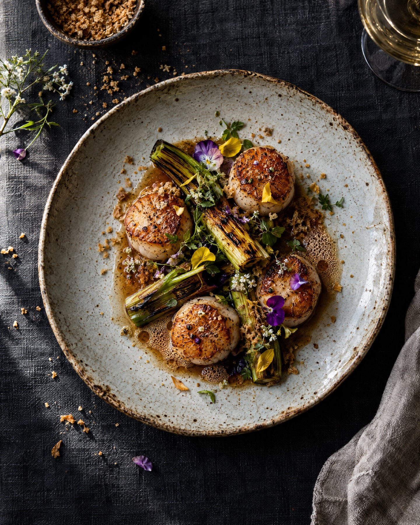
A specimen book of pure design: type, color, components, surfaces, shapes, imagery and layout. Every element is plain HTML and CSS, styled by Claude, with a few generated images from Higgsfield where a photo belongs.

01 Typography

Type specimen

Three families, one scale. A serif for display, a variable sans for reading and a mono for labels, with every weight of the variable axis.

  • Type scale
  • Variable font
AaInstrument SerifDisplay / Italic
AaInter TightText / 100 to 900
AaJetBrains MonoLabels / Code

Display 96

Heading one, 56

Heading two, 38

Heading three, 26

Body text at 17 pixels with a comfortable 1.6 line height. The quick brown fox jumps over the lazy dog and then reads every footnote.

Caption / 12 / Uppercase mono

AgAgAgAgAgAgAgAgAg
Text effects

Twelve treatments for headlines, all live text you can select: gradients, outlines, image fills, shadows, glows, knockouts and hand-drawn marks.

  • background-clip
  • text-stroke
  • text-shadow
Gradientbackground-clip
Outlinetext-stroke
Chromeimage fill
Longstacked shadow
Neonglow
Knockknockout
Layeroffset layers
Markedhighlighter
SquiggleSVG underline
Splittwo-tone
Widetracking
Elegant &italic ligature

Editorial details

Kicker, headline, dek, byline, drop cap, small caps, a pull quote and footnotes. The furniture that makes long text feel designed.

  • ::first-letter
  • font-variant
Field notes

Slow design for fast screens

Why the best interfaces borrow their rhythm from print.

By Claude / 6 min read

Good typography is invisible until it is missing. Small caps set abbreviations quietly, hanging punctuation keeps the edge clean, and a footnote1 waits politely at the bottom.

“Whitespace is not empty. It is the pause between notes.”

1 Like this one.

List styles

Big-number steps, checklists, a timeline and a definition list, all from CSS counters and pseudo-elements.

  • CSS counters
  • Pseudo-elements
  1. Brief Who is it for?
  2. Shape Grid and type first.
  3. Ship Test, then publish.
  • Fast
  • Accessible
  • Bloated
  1. 2024First sketch
  2. 2025Public beta
  3. 2026Version one
Kerning
Space between two letters.
Leading
Space between lines.

02 Color

Color palettes

Four palettes with names and values. Click any swatch to copy its hex code.

  • Palette
  • Clipboard
Ember
Fjord
Orchard
Neon

Gradients

Linear, radial, conic, mesh, aurora, holographic, grain, duotone and a hard-stop sunset. Only the duotone uses a photo; the rest is pure CSS.

  • conic-gradient
  • Mesh gradient
Linear
Radial
Conic
Mesh
Aurora
Holo
Grain
Duotone
Hard stops

Live color tokens: recolour the site

These are the colours the whole site is built from, read live from its CSS. Click a swatch to pick a new colour and everything on the page that uses it changes at once. Try a ready-made palette or switch theme; Reset puts it all back. Nothing is saved: a reload starts fresh.

  • Custom properties
  • Theming
Theme
Palette

Click any swatch to change that colour across the whole page.

03 Components

Buttons

Fifteen button styles, from quiet to loud. Hover and press them: each has its own feedback.

  • States
  • Micro-interaction
Read more

Badges, tags and chips

Status dots, counters, removable chips, a ribbon and keycaps.

  • Small UI
LivePendingFailedDraft
#design#cssNewBeta
Copenhagen Lisbon
9SaleCard⌘ShiftP

Cards

Eight card patterns: product, profile, stat, article, glass, soft, brutal and gradient border. The same building block, very different jobs.

  • Composition
  • Hierarchy
Seared scallops
Tasting menuScallops & leek$18
Pip the foxPipStudio mascot
128Posts4.2kFans
Revenue$48,210▲ 12.4%
StyleThe architecture of a coat
GlassFrosted panel

Backdrop blur over color.

SoftNeumorphic

Light from the top left.

BrutalNO FRILLS.

Hard shadow, thick line.

PremiumGradient border

A conic ring around the card.

Form fields

Floating labels, underlines, icons, custom checkboxes and radios, switches and an error state.

  • :placeholder-shown
  • appearance

Progress and loading

Linear, striped, segmented and ring progress, a skeleton screen and three spinners.

  • Skeleton
  • SVG ring
25 60 90

Messages and empty states

Four alert levels, a callout and an empty state with a small drawn illustration.

  • Status color
iHeads up. A new version is ready.
✓Saved. Your changes are live.
!Almost full. 92% of storage used.
×Payment failed. Try another card.
No projects yetStart one and it will show up here.

Avatars

Sizes, initials, a stacked group, status dots and a gradient story ring.

  • object-fit
  • Overlap
PipPipPipPip
ALGHMJKT
PipModelBolt+5
BoltModelPip

Data display

KPI tiles with change indicators, a donut with its legend and a ranked bar list. Small, honest charts.

  • SVG charts
  • KPI
Visitors24.8k▲ 8%
Bounce31%▼ 3%
Session4:12▲ 22s
  • Search 55%
  • Social 30%
  • Direct 15%
Copenhagen4.1k
Berlin3.0k
Lisbon1.9k

04 Surfaces and shape

Shadows and elevation

Five elevation steps built from layered shadows, then a colored glow, a long shadow, an inset and a hard offset.

  • box-shadow
  • Depth
1
2
3
4
5
Glow
Long
Inset
Hard

Shapes

Clip paths and radii: hexagon, star, arrow, chevron, blob, arch, ticket and squircle.

  • clip-path
  • mask
Hexagon
Star
Arrow
Chevron
Blob
Arch
Ticket
Squircle

Borders and frames

Gradient, dashed, double, a rotating conic border, corner brackets, notched corners, a stitched edge and an offset outline.

  • border-image
  • @property
Gradient
Dashed
Double
Rotating
Brackets
Notched
Stitched
Offset

Section dividers

Six SVG edges for the seam between two sections: wave, tilt, curve, zigzag, mountains and drips.

  • SVG
  • Section edges
Wave
Tilt
Curve
Zigzag
Mountains
Drips

Background patterns

Twelve repeating patterns, each a single element. Most are pure CSS gradients; the plus, cube and noise tiles are tiny inline SVGs.

  • repeating-gradient
  • background-size
Dots
Grid
Stripes
Diagonal
Checker
Zigzag
Waves
Plus
Cubes
Plaid
Blueprint
Noise

One card, eight styles

The same content dressed in eight visual languages: Swiss, brutalist, glass, soft, clay, Y2K chrome, editorial and retro terminal.

  • Art direction
  • Design systems
01Launch week

Five days, five releases.

02Launch week

Five days, five releases.

03Launch week

Five days, five releases.

04Launch week

Five days, five releases.

05Launch week

Five days, five releases.

06Launch week

Five days, five releases.

07Launch week

Five days, five releases.

08> launch_week

5 days. 5 releases.

05 Imagery

Frames and device mockups

Generated photos presented six ways: polaroid, browser window, phone, laptop, a fanned stack and a gradient mat. All drawn in CSS.

  • Images
  • Mockups
Pip the fox
pip, studio day
restaurant.example
Scallops
Editorial photo
Interior render
Bolt the robot
Misty valley at sunrise

Image masks

Photos cut seven ways: through type, as a circle, an arch, a blob, a hexagon, a soft fade and a diagonal split.

  • Image
  • mask-image
WILD

Icon set in three styles

Twelve icons drawn once in SVG and shown as line, duotone and solid, switched by CSS alone.

  • SVG symbols
  • Iconography
Line
Duotone
Solid

Logo marks

Eight geometric marks for fictional studios, built from circles, squares and lines on a strict grid.

  • SVG
  • Identity
Orbit & Box
Venn
Westline
Summit
Nine
Tide
Compass
Cube

Ornaments and marks

Separators, quotation marks, an asterism, arrows, stars and numerals: the small typographic jewelry.

  • Unicode
  • Decoration
❦
⁂
◆ ◇ ◆
“
← ↑ → ↓ ↗ ↘ ⟶ ↻
★★★★★
①②③IV05

06 Layout

Layout systems

A 12-column grid with its overlay, a bento layout, a masonry wall and the golden ratio. Hover the grid to see its columns.

  • CSS Grid
  • Columns
Header
Aside
Main / 8 columns
Footer
BentoBig idea
98%uptime
Wide
1 : 1.618

Spacing and radius scales

The rhythm behind a layout: an eight-step spacing scale and six corner radii, shown at true size.

  • Design tokens
  • Rhythm
4
8
12
16
24
32
48
64
0
4
10
18
28
full